MODERN BY NATURE
RUSTIC MATERIALS AND STREAMLINED FORMS ALLOW A MARTIS CAMP HOME TO MELD WITH ITS WOODED SURROUNDINGS
by Mindy Pantiel
When designer Dara Rosenfeld was hired by a Bay Area couple to craft the interiors of their Lake Tahoe vacation retreat within Martis Camp, two things were clear. First, the husband had a definite vision. “He wanted a rustic feel delivered in a clean, streamlined way,” says Rosenfeld, who arrived on the scene after both the mountain-modern theme and most of the material palette had been established. Second, the architecture was the dominant design force. “It was my job to create interiors that were a seamless extension of the architecture,” she says.
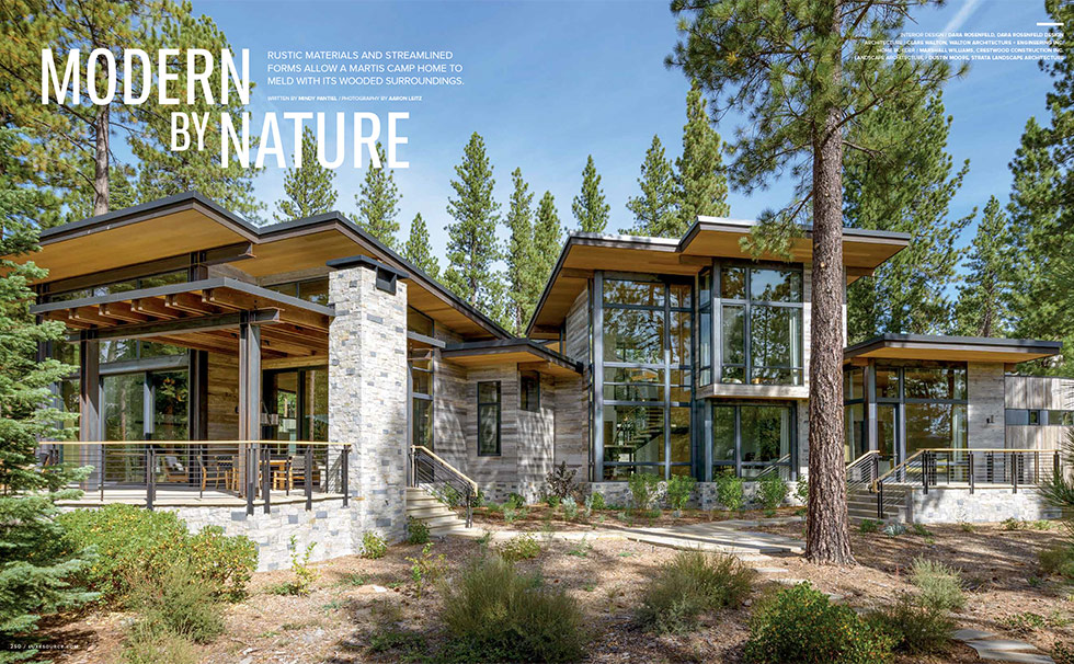
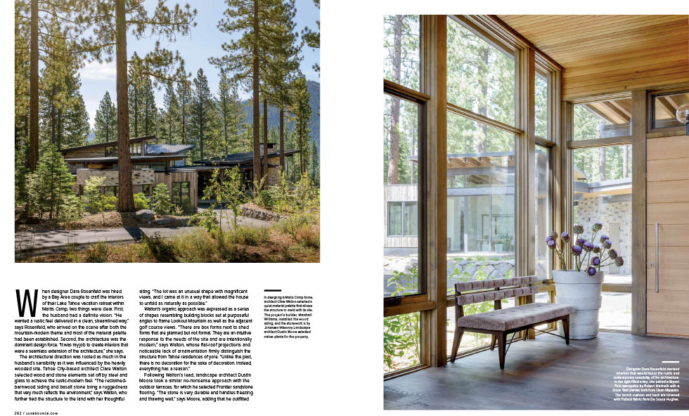
The architectural direction was rooted as much in the husband’s sensibility as it was influenced by the heavily wooded site. Tahoe City-based architect Clare Walton selected wood and stone elements set off by steel and glass to achieve the rustic-modern feel. “The reclaimed-barnwood siding and basalt stone bring a ruggedness that very much reflects the environment,” says Walton, who further tied the structure to the land with her thoughtful siting. “The lot was an unusual shape with magnificent views, and I came at it in a way that allowed the house to unfold as naturally as possible.”
Walton’s organic approach was expressed as a series of shapes resembling building blocks set at purposeful angles to frame Lookout Mountain as well as the adjacent golf course views. “There are box forms next to shed forms that are planned but not formal. They are an intuitive response to the needs of the site and are intentionally modern,” says Walton, whose flat-roof projections and noticeable lack of ornamentation firmly distinguish the structure from Tahoe residences of yore. “Unlike the past, there is no decoration for the sake of decoration. Instead, everything has a reason.”
Following Walton’s lead, landscape architect Dustin Moore took a similar no-nonsense approach with the outdoor terraces, for which he selected Frontier sandstone flooring. “The stone is very durable and handles freezing and thawing well,” says Moore, adding that he outfitted the metal railings along the terrace with built-in lights and speakers. “It’s fairly stealth and avoids things like speakers popping up in the landscape.” The latter he filled with native plants, such as red twig dogwood, thimbleberry and Sierra currant selected to make the house meld with the natural surroundings.
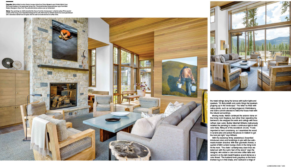
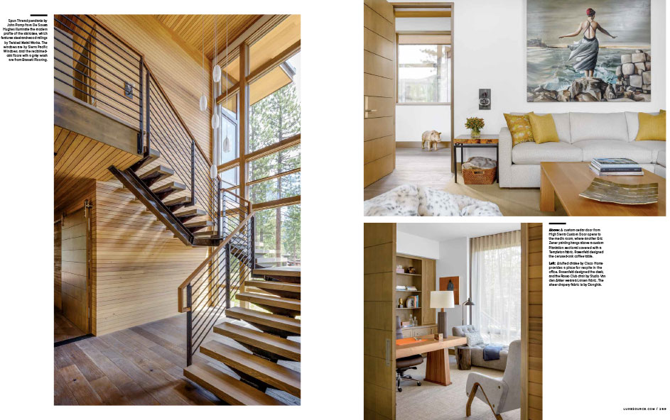
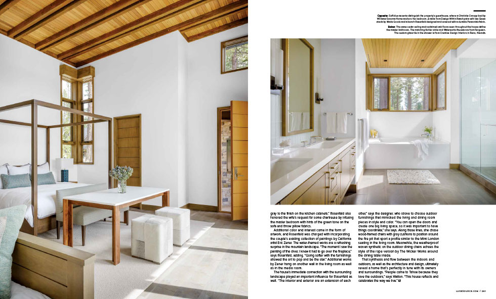
Moving inside, Walton continued the exterior stone on the living room fireplace, but rather than repeating the barnwood, she wrapped the walls and ceilings with more refined clear cedar. Builder Marshall Williams meticulously installed the paneling to create a continuous light-to-dark color fade, fitting all of the woodwork on-site. “It was important to have consistency, so I assembled the wood in several piles and picked the pieces in rotation to get the look just right,” says Williams.
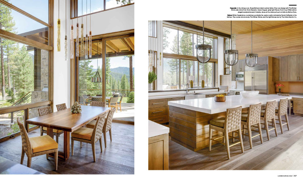
With the backdrop firmly established, Rosenfeld introduced colors and furnishings in sync with the rustic meets-modern directive. With their geometric frames, a quartet of Mimi London lounge chairs in the living room hit the mark. “The chairs’ contemporary clean lines are balanced with the rustic feel of the wood,” says the designer, who added a cast-concrete coffee table and zeroed in on the dark basalt fireplace accent stones as a color thread. “The husband loves gray-blue, so the handknotted rug is in that shade, and I worked in a tinge of gray to the finish on the kitchen cabinets.” Rosenfeld also honored the wife’s request for some chartreuse by infusing the master bedroom with hints of the green tone on the sofa and throw pillow fabrics.
Additional color and interest come in the form of artwork, and Rosenfeld was charged with incorporating the couple’s existing collection of paintings by California artist Eric Zener. The water-themed works are a refreshing surprise in the mountain landscape. “The moment I saw the painting of the diver, I knew it had to go over the fireplace,” says Rosenfeld, adding, “Going softer with the furnishings allowed the art to pop and be the star.” Additional works by Zener hang on another wall in the living room as well as in the media room.
The house’s immediate connection with the surrounding landscape played an important influence for Rosenfeld as well. “The interior and exterior are an extension of each other,” says the designer, who strove to choose outdoor furnishings that mimicked the living and dining room pieces in style and color. “You can open the doors and create one big living space, so it was important to have things coordinate,” she says. Along those lines, she chose wood-framed chairs with gray cushions to position around the fire pit that sport a profile similar to the Mimi London seating in the living room. Meanwhile, the weatherproof woven synthetic on the outdoor dining chairs echoes the style of the rope version by The Wicker Works around the dining table inside.
That synthesis and flow between the indoors and outdoors, as well as the architecture and design, ultimately reveal a home that’s perfectly in tune with its owners and surroundings. “People come to Tahoe because they love the outdoors,” says Walton. “This house reflects and celebrates the way we live.”

