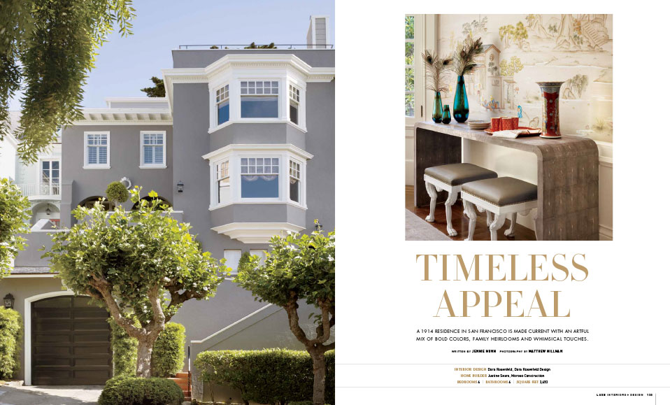
TIMELESS APPEAL
A 1914 RESIDENCE IN SAN FRANCISCO IS MADE CURRENT WITH AN ARTFUL IX OF BOLD COLORS, FAMILY HEIRLOOMS AND WHIMSICAL TOUCHES.
by Jennie Nunn
When San Francisco-based designer Dara Rosenfeld was hired to transform a residence in the city’s Cow Hollow neighborhood into a sophisticated Parisian-inspired dwelling for a couple and their two children, it wasn’t exactly a random coincidence. “I had designed their second home in Hawaii,” says Rosenfeld, who studied art history at Boston University and spent time at Christie’s, Peter Marino Architect and The Wiseman Group before launching her own firm in 2007. “Usually it’s the other way around: You design a first home and then do the vacation home, but we just hit it off. They called me right away when they bought this house and said, ‘Come help!'”
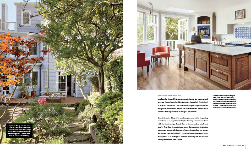
Though designed in 1914 by architect Albert L. Farr, the distinguished house wasn’t without a set of design challenges. “The whole place was so dated,” says Rosenfeld of interiors marked by dusty rose-hued carpet, ballerina-pink wallpaper and lots of chintz. “I wanted to come in with a fresh vision and make it modern for today.” She found inspiration in the couple’s penchant for Paris and built an orange-and-charcoal gray palette around a vintage Hermès box and an Hermès blanket the wife had. “The husband is more of a traditionalist,” says Rosenfeld, noting the English and French antiques he had inherited. “And the wife is more modern The idea was to combine those styles and make the space feel timeless.”
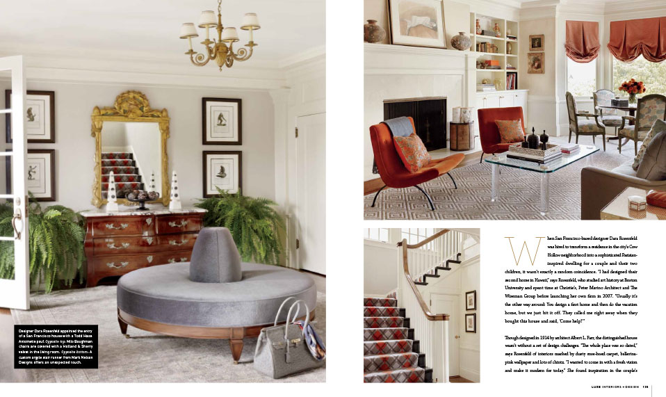
Rosenfeld started things off by creating a glamorous yet inviting setting reminiscent of an elegant hotel lobby for the entry, which she appointed with the client’s antique French chest of drawers and an upholstered pouf by Todd Hase. It was also important to the couple that the interiors incorporate unexpected elements to keep it from feeling too serious. An adjacent staircase line with a custom orange-and-gray argyle carpet accomplishes all of those goals. “I wanted something that one wouldn’t usually see on stairs,” adds the wife.
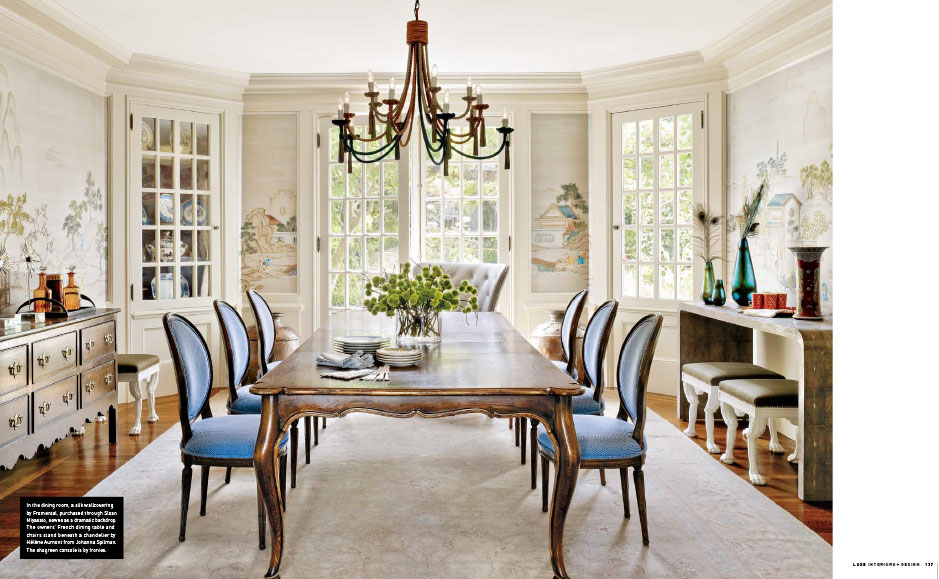
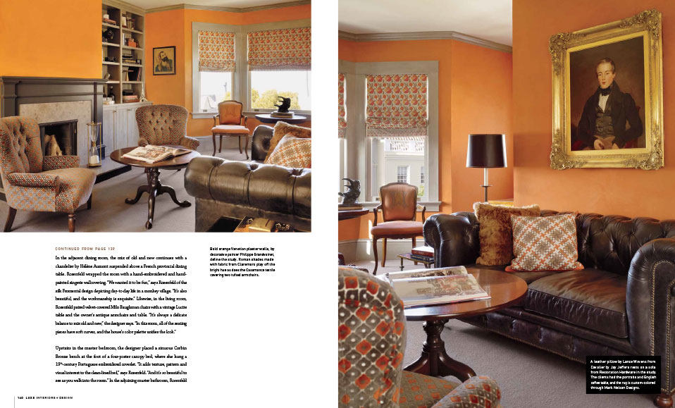
In the adjacent dining room, the mix of old and new continues with a chandelier by Hélène Aumont suspended above a French provincial dining table. Rosenfeld wrapped the room with a hand-embroidered and hand-painted singerie wallcovering. “We wanted it to be fund,” says Rosenfeld of the silk fromental design depicting day-to-day life in a monkey village. “It’s also beautiful, and the workmanship is exquisite.” Likewise, in the living room, Rosenfeld paired velvet-covered Milo Baughman chairs with a vintage Lucite table and the owner’s antique armchairs and tables. “It’s always a delicate balance to mix old and new,” the designer says. “In this room, all of the seating pieces have soft curves, and the house’s color palette unifies the look.”
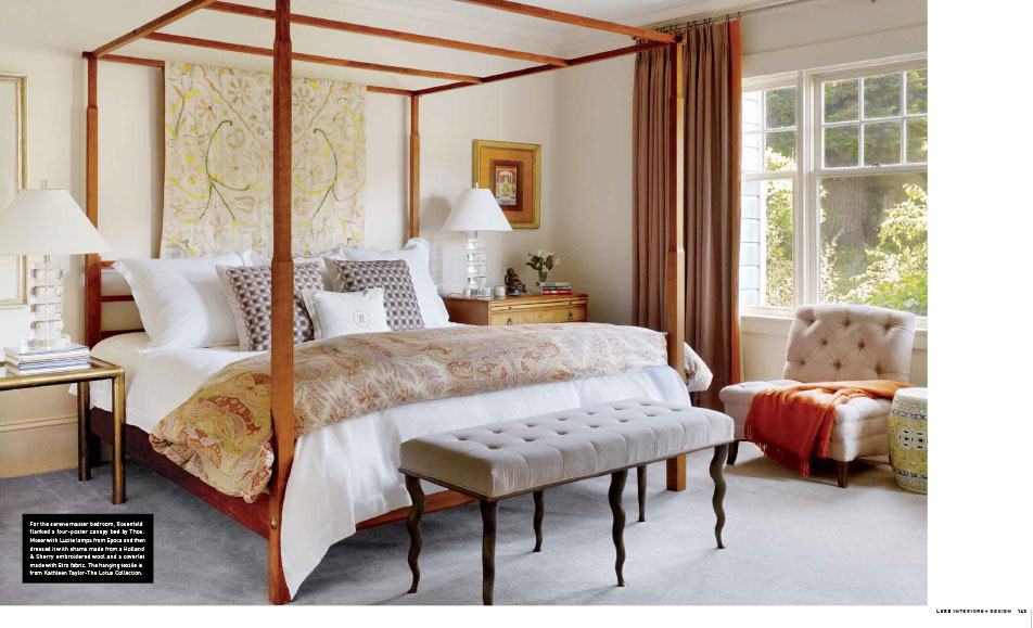
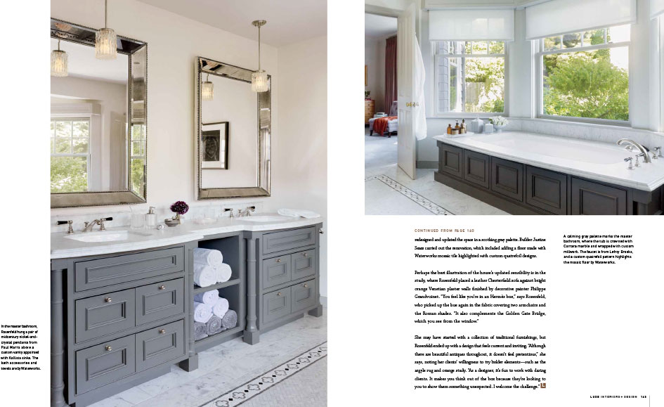
Upstairs in the master bedroom, the designer placed a sinuous Corbin Bronze bench at the foot of a four-poster canopy bed, where she hung a 19th-century Portuguese embroidered coverlet. “It adds texture, pattern and visual interest to the clean-lined bed,” says Rosenfeld. “And it’s so beautiful to see as you walk into the room.” In the adjoining master bathroom, Rosenfeld redesigned and updated the space in a soothing gray palette. Builder Justine Sears carried out the renovations, which included adding a floor made with Waterworks mosaic tile highlighted with custom quatrefoil designs.
Perhaps the best illustration of the house’s updated sensibility is in the study, where Rosenfeld placed a leather Chesterfield sofa against bright orange Venetian plaster walls finished by decorative painter Philippe Grandvoinet. “You feel like you’re in a Hermès box,” says Rosenfeld, who picked up the hue again in the fabric covering two armchairs and the Roman shades. “It also complements the Golden Gate Bridge, which you see from the window.”
She may have started with a collection of traditional furnishings, but Rosenfeld ended up with a design that feels current and inviting. “Although there are beautiful antiques throughout, it doesn’t feel pretentious,” she says, noting her clients’ willingness to try bolder elements—such as the argyle rug and orange study. “As a designer, it’s fun to work with daring clients. It makes you think out of the box because they’re looking to you to show them something unexpected. I welcome the challenge.”

