Interior design: Neutral palettes don’t mean boring
For the past dozen years or so, the Pantone Color Institute has anointed a color of the year. For 2012, the reddish orange Tangerine Tango replaced Honeysuckle, a shade of pink. Previous selections include Turquoise, Chili Pepper and Blue Iris.
Keeping up with the ever-changing color trends can be a bit much for some, though. Fortunately for those not inclined to decorate with an abundance of saturated hues, a neutral palette doesn’t have to be beige and boring.
By most expert accounts, the key to achieving a beautiful, muted interior is texture. “If the fabrics are all the same tone, texture will differentiate them because light reflects directly off every surface,” says San Francisco interior designer Dara Rosenfeld, whose favorite neutral paint colors include Farrow & Ball’s String (No. 8) and Shaded White (No. 201). “For example, I recently mixed a taupe basket-weave linen with cream velvet and ivory silk pillows.”
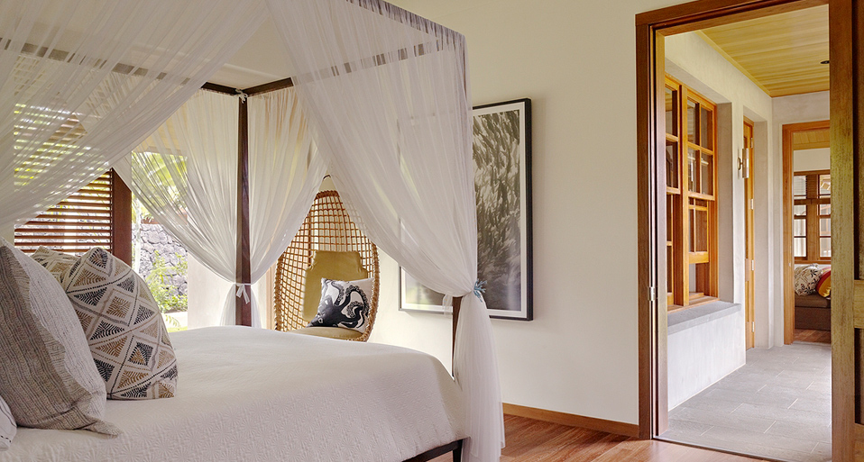
For drama and visual interest, Rosenfeld recommends accessorizing with antiques with a warm finish, metallic objects or a bold piece of art. “In a white bedroom in Hawaii, we added graphic pop with a black-and-white art piece and black-and-gold pillow shams,” she says.
FEATURED PROJECT: KONA MODERN